







Design System
Citric Design System
Citric is a design system that helps create clean, consistent, and scalable interfaces. It unifies styles, components, and rules, making the design process faster.
A unified system of reusable foundations and components that brings clarity, consistency, and structure to every interface.
What's inside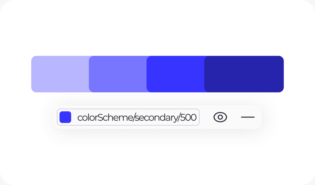
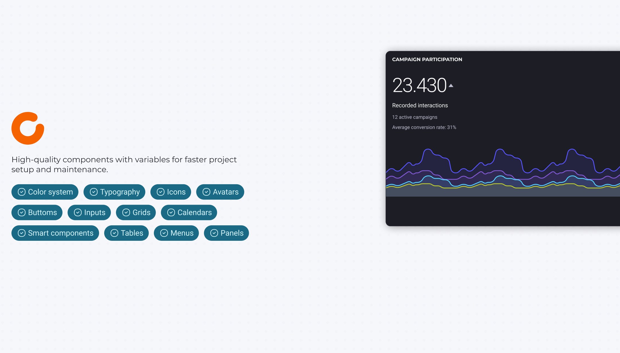
Color system
Consistent color tokens and palettes for scalable themes and clear visual hierarchy.
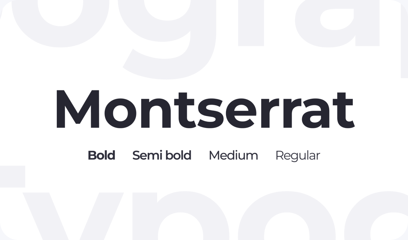
Typography
A flexible type system with predefined roles and scales for readable interfaces.
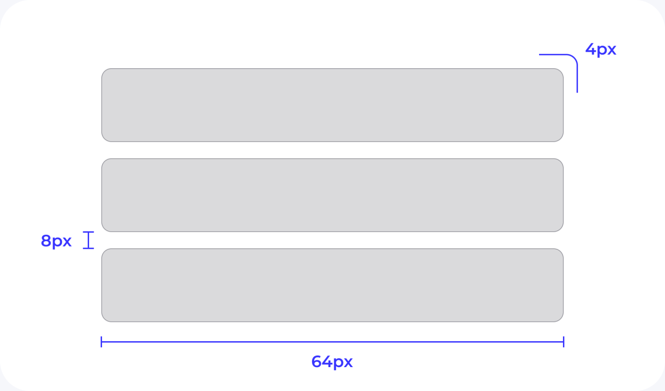
Spacing and Radius
Structured spacing, sizing, and corner rules that keep layouts balanced and predictable.
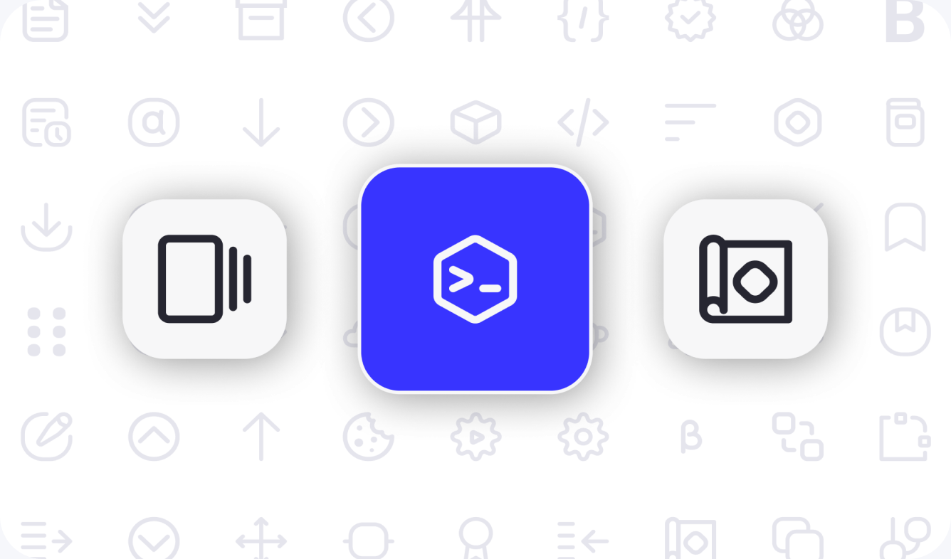
Icons
A huge icon set designed to stay clear, meaningful, and visually aligned.
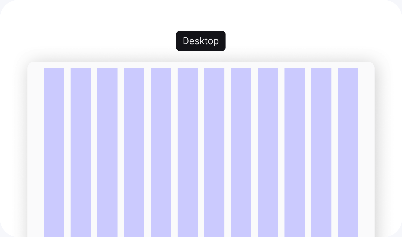
Grid System
Responsive grids for consistent layouts across screen sizes and breakpoints.
Shadows and more
Depth and elevation styles that add clarity, focus, and visual rhythm.
Atomic design principles
Atomic Design is a modular approach that breaks interfaces into reusable pieces, making their structure clear and connected.
Design Tokens
Core variables that define colors, typography, spacing.
Atoms
The smallest UI parts: icons, buttons and input fields.
Molecules
Groups of atoms forming simple components.
Organisms
Larger components made of molecules and atoms.
Templates
Layouts showing how components connect within a structure.
Pages
Final screens filled with real data and content.
Design systems start with strong foundations.
They define how components look, behave, and scale across the entire product.
Typography
FoundationsThe typographic system defines text styles as design tokens and explains how titles and body text should be applied.
A wide range of clearly organized text styles, making it easy to select the right option for any screen or interface element.

Color system
FoundationsA flexible palette of semantic and functional colors that keeps interfaces consistent, clear, and expressive across the entire product.
Primitive colors
As the foundation of the palette, primitive colors define backgrounds, text, and neutral Ul surfaces, creating a consistent base that supports semantic and brand palettes across the entire interface.
Every color combination in the system was validated against WCAG contrast standards. This ensures that text and Ul elements remain readable and accessible across light and dark themes, regardless of size, state, or context.
Spacing and radius
FoundationsA consistent spacing and radius scale creates visual rhythm and predictable layouts. Each value exists as a reusable token, simplifying alignment across the interface.

Spacing
By establishing consistent Spacing values for margins, paddings, and alignments, teams can achieve visual harmony and enhance the overall user experience.


Border Radius
Radius help make Ul personable, easier to process, and recognizable at a glance. Selecting the correct radius for components builds consistent visual vocabulary and narrative.


Shadows
FoundationsShadows create depth and focus within the interface. A unified scale ensures visual hierarchy and keeps components looking consistent across different contexts.

Grid System
FoundationsShadows create depth and focus within the interface. A unified scale ensures visual hierarchy and keeps components looking consistent across different contexts.

Icons
FoundationsA unified icon system built on consistent stroke, size, and grid rules. Icons stay clear and readable at any scale and adapt to semantic colors automatically.

+250 icons
A comprehensive library of more than 250 icons, carefully organized into four distinct categories. Quickly find what you need through an intuitive structure that simplifies navigation, reduces search time, and makes icon selection faster and more efficient.
Illustrations
FoundationsTo create a more consistent and engaging experience across the ecosystem, Citric includes a dedicated illustration library designed to support communication, orientation, and empty-state experiences throughout the product. The illustration system is organized into two main categories: Entity Illustrations and Error State Illustrations.
Entities
Were created to represent the core objects and modules available across the platform. These illustrations act as visual placeholders in empty states, onboarding moments, and content creation flows, helping users quickly understand the context of each section. The library includes dedicated illustrations for entities such as Accounts, Studios, Workspaces, Service Catalog, Stacks, Actions, and other product modules, ensuring visual consistency regardless of where users are navigating.

Error States
Were designed to make system feedback more approachable and human. Rather than relying solely on text messages, these illustrations help communicate issues such as missing content, unavailable resources, permission restrictions, and unexpected failures, reducing frustration while maintaining the product’s visual identity.

Simple Components
A library of essential Ul components built on shared tokens and properties. Each element follows the same spacing, sizing, and state logic to keep the interface consistent.
Buttons
Built with semantic colors and consistent states for clarity.
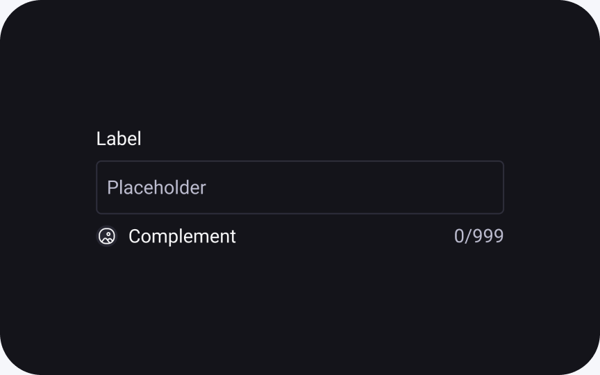
Input Fields
Clear hierarchy: label, field, help text, and validation states.
Badge
Highlights status or count using semantic color tokens.
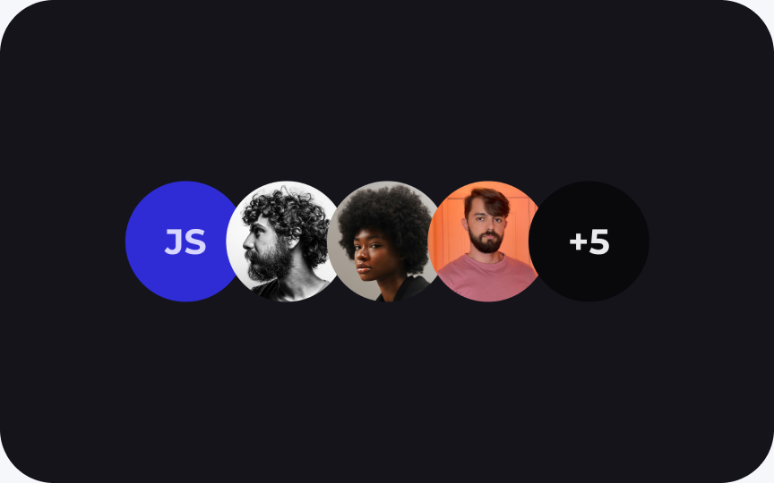
Avatars
Visual identifiers with support for user status and grouping.
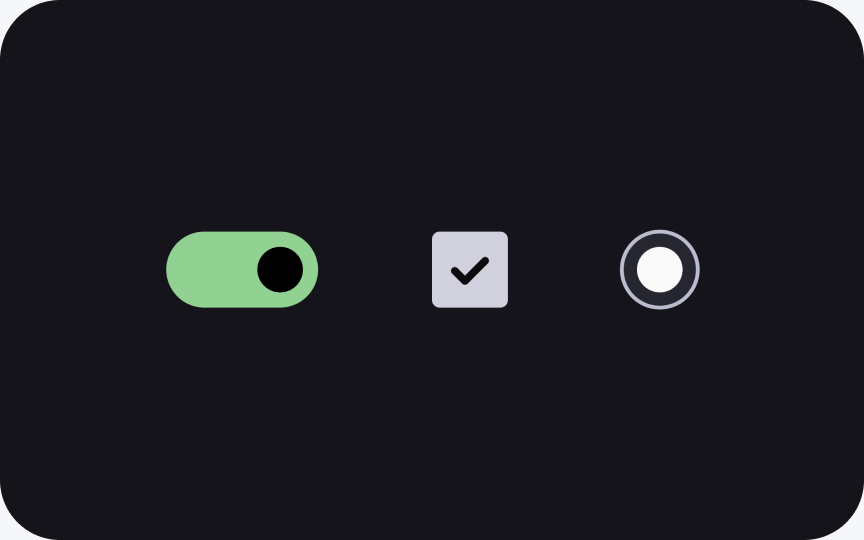
Switch and more
Simple selection controls with clear active and focus states.
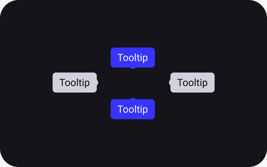
Tooltips
Reveals additional context without interrupting the flow.
Buttons
Buttons adapt to different use cases through shared variables: size, palette, type, and state. Every button follows the same spacing, grid, and logic, making interactions consistent across the entire interface.

Smart variations
Buttons are built on semantic tokens and adaptive properties. Sizes, colors, and icons can be adjusted through variables, keeping the component flexible while preserving structure and clarity.

Input Fields
Input fields are built from reusable tokens — spacing, states, icons, and labels. This keeps interactions predictable and helps designers build forms faster.

Anatomy
The core structure includes label, field, and help text. Optional add-ons - prefix/suffix, icons, actions, and masks — fit the same grid and spacing for clarity.

States and variants
Inputs support multiple visual styles and clear interaction states — default, typing, focus, error, disabled — ensuring predictable behavior across scenarios.

Badges
A unified icon system built on consistent stroke, size, and grid rules. Icons stay clear and readable at any scale and adapt to semantic colors automatically.

Smart variations
Badges use the same spacing, color, and rules, keeping the interface consistent while adapting to different states and palettes.

Avatars
Avatars visually represent users, team members, or entities. They adjust to any context - supporting text initials, photos, or custom illustrations.

Smart variations
Built on shared sizing, spacing, and color tokens, avatars remain consistent across shapes and content types. They adapt to text initials, images, and illustrations, ensuring clarity and visual balance in any context.

Sizes
Choose the most appropriate size for each use case. Avatars scale consistently while preserving legibility, proportions, and visual recognition across lists, cards, tables, and collaborative experiences.

Colors
Use color variations to enhance identity, differentiation, and quick user recognition. Each option follows the design system palette, ensuring visual consistency and accessible contrast across different contexts and interfaces.

Switches, checkboxes, radiobuttons
These controls allow users to make quick selections or toggle states. Each component adapts to various palettes, sizes, and interaction states while maintaining a unified visual language.

Smart Variations
All components follow shared spacing, sizing, and stroke rules, ensuring consistent visuals and interaction patterns across the entire interface.

Tooltips
Tooltips provide quick contextual hints without interrupting the user flow. They appear on hover or focus and help users understand actions, icons, or controls instantly.

Lightweight and informative
Tooltips adapt to different placements and component sizes, keeping spacing and styling consistent across variations.

Complex Components
Complex components combine multiple simple components into structured patterns. Each one follows shared spacing, typography, and semantic rules, ensuring consistency, scalability, and predictable behavior across the interface.
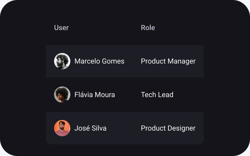
Tables
Designed for efficient content scanning with clear hierarchy and spacing.
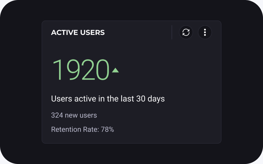
Panels
Present key metrics at a glance using compact and structured layouts.
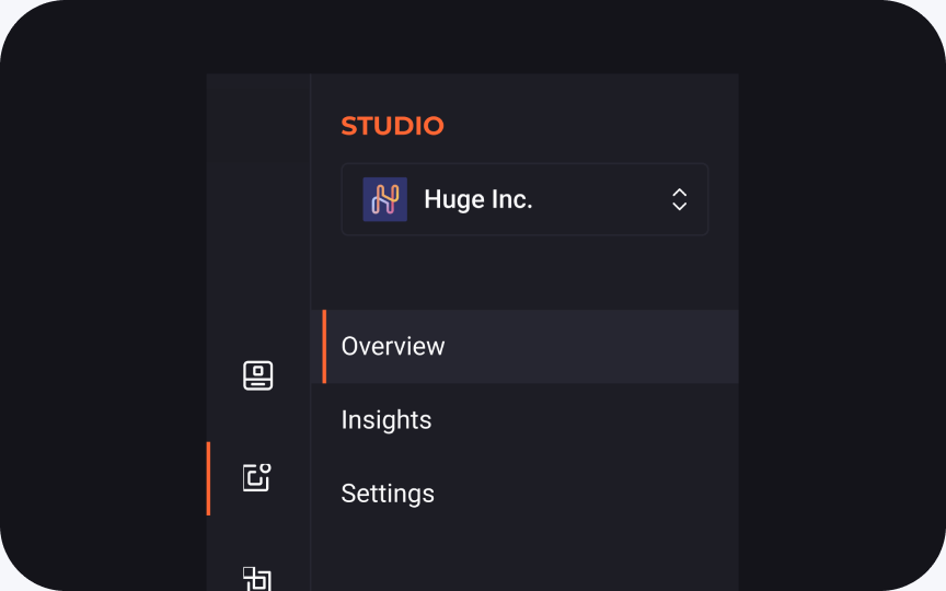
Menu
Contextual actions grouped logically to improve user decision-making.
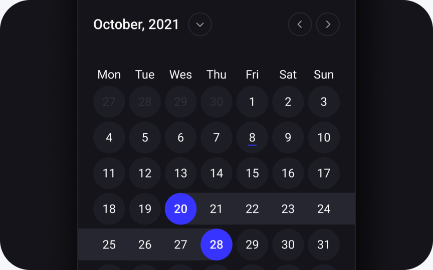
Calendar
Display dates and events clearly with adaptive layout and spacing tokens.
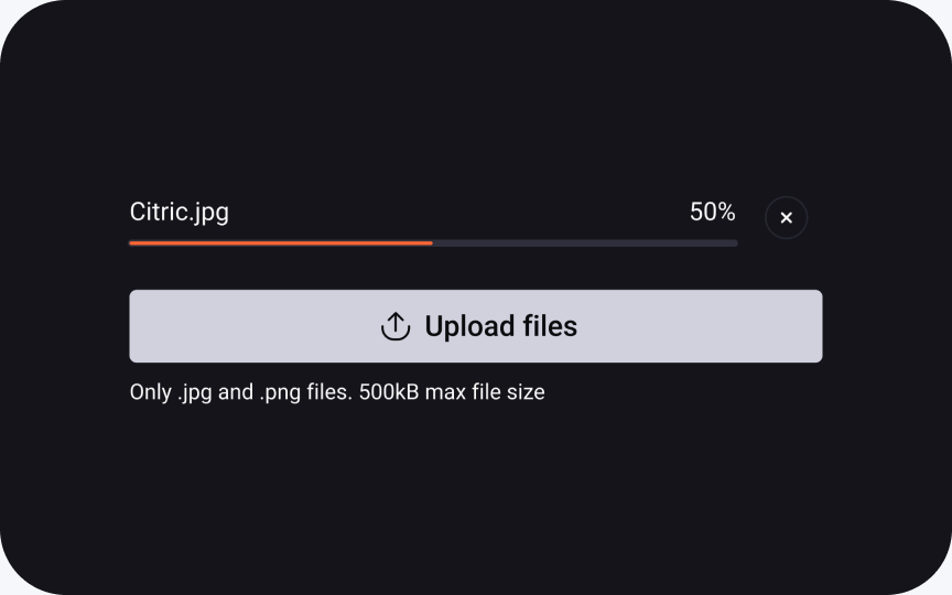
File uploader
Handles different file states with clear progress and feedback patterns.
And 58+ more components
Tables
Tables combine multiple Ul components — filters, pagination, badges, icons — into a flexible data-presentation pattern. Shared spacing, typography, and interaction rules keep the interface clear and easy to scan.

Reusable cell components
Table cells reuse simple Ul components — Avatars, Buttons, Rating, Progress — resulting in scalable layouts that are easy to adjust without breaking consistency.

Panels
Statistical widgets visualize key metrics in a clear and compact format. Data, labels, icons and states are combined into flexible cards that adapt to any scenario - from dashboards to detail views.

Flexible data cards
Cards follow consistent spacing tokens and structure, adapting to any data type - numbers, charts, or progress indicators. Components remain clean and readable at any size, making metrics easy to compare and visually scan.

Menu
The structure adapts to the context - from simple dropdowns to complex multi-level navigation — keeping actions clear, accessible, and easy to scan.

Flexible and scalable
Menus support icons, labels, shortcuts, and nested groups. The layout adapts to different levels of complexity and content density, preserving clarity and effortless navigation. Consistent spacing and typography maintain a clean structure across all variations.


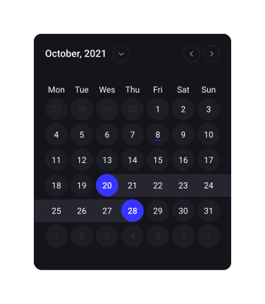
Calendar
A flexible date-selection system with multiple presets, ranges, and shortcuts. Components stay clear and responsive on any layout, making scheduling fast and effortless.

Calendar interactions stay intuitive
Calendars support multiple selection modes, shortcuts, and quick-range presets. Components adapt to different layouts and remain readable at any scale, helping users pick dates faster without breaking their flow.

File uploader
File uploader enables quick and intuitive file submission with real-time feedback. The component adapts to different states — uploading, success, or error — while keeping the interface clean and predictable.

Upload states
Clear visual states (uploading, success, error) help users understand progress instantly. Layout and spacing adapt depending on the number of files, ensuring readability and control at every step.

Build pages effortlessly
With a rich library of reusable components and consistent design rules, pages can be assembled in minutes - simply combine blocks, adjust content, and you're ready to ship. No extra styling or manual alignment required.
More projects
View all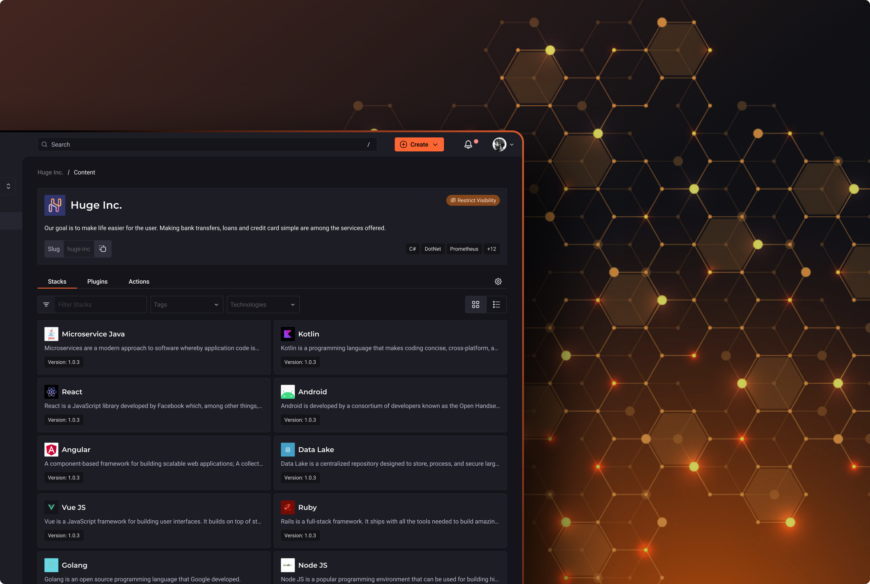 UI / UX Design
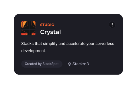
StackSpot
UI / UX Design
StackSpot
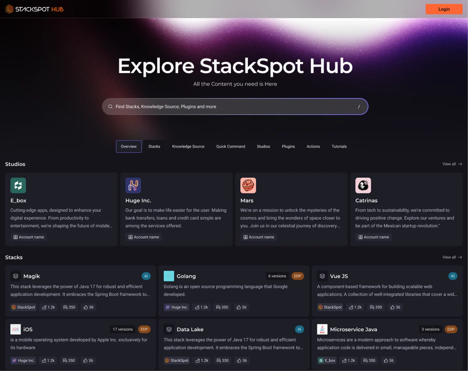
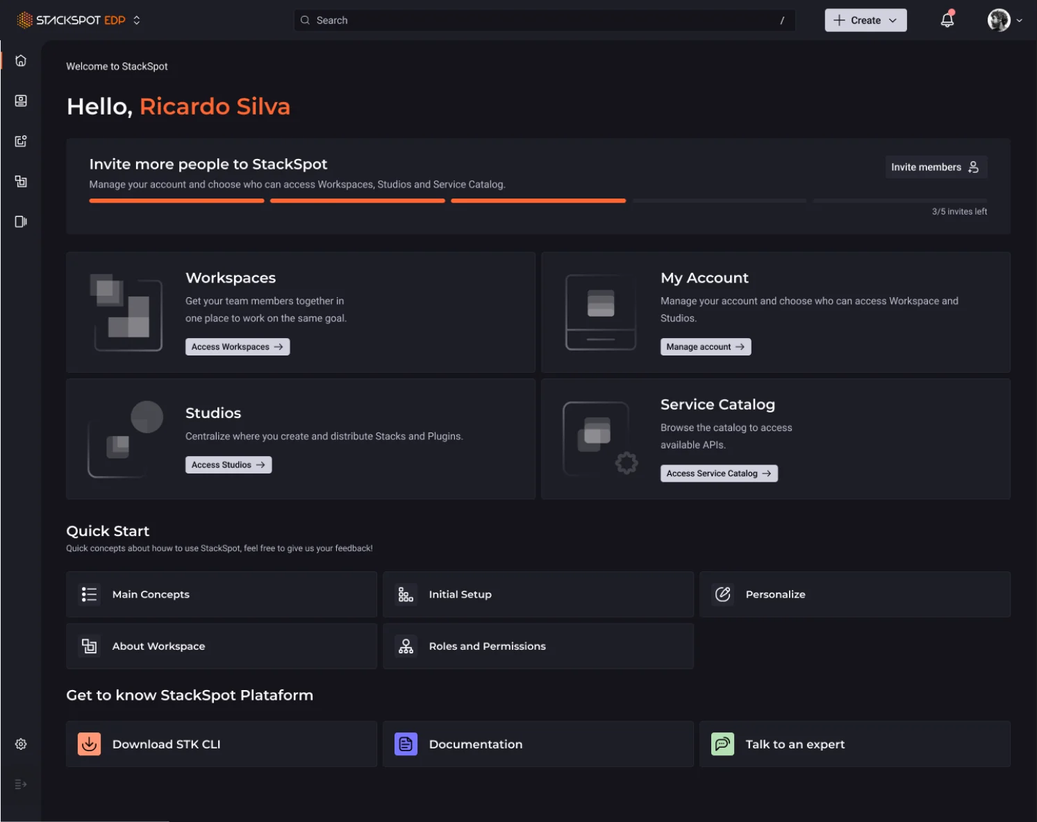
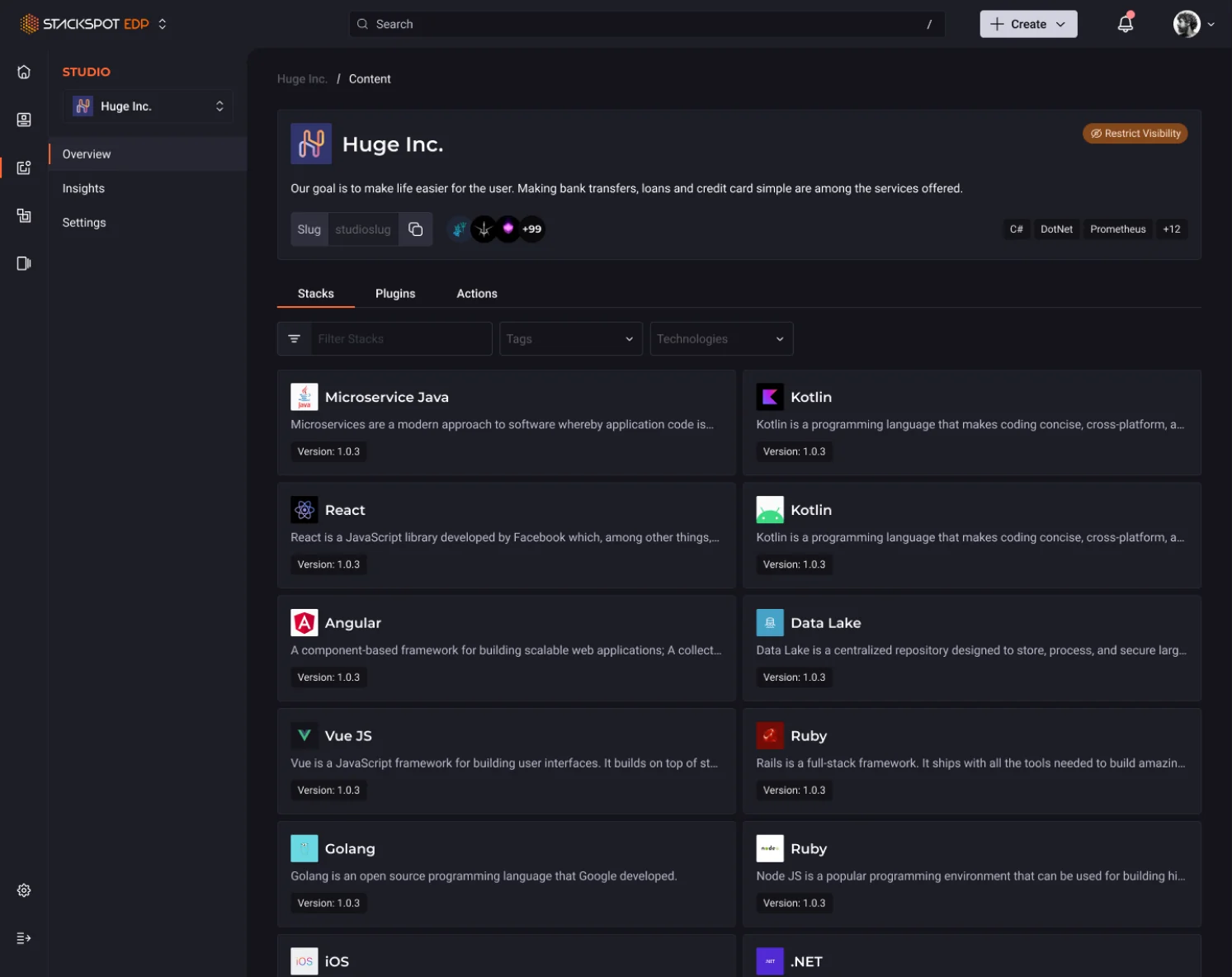
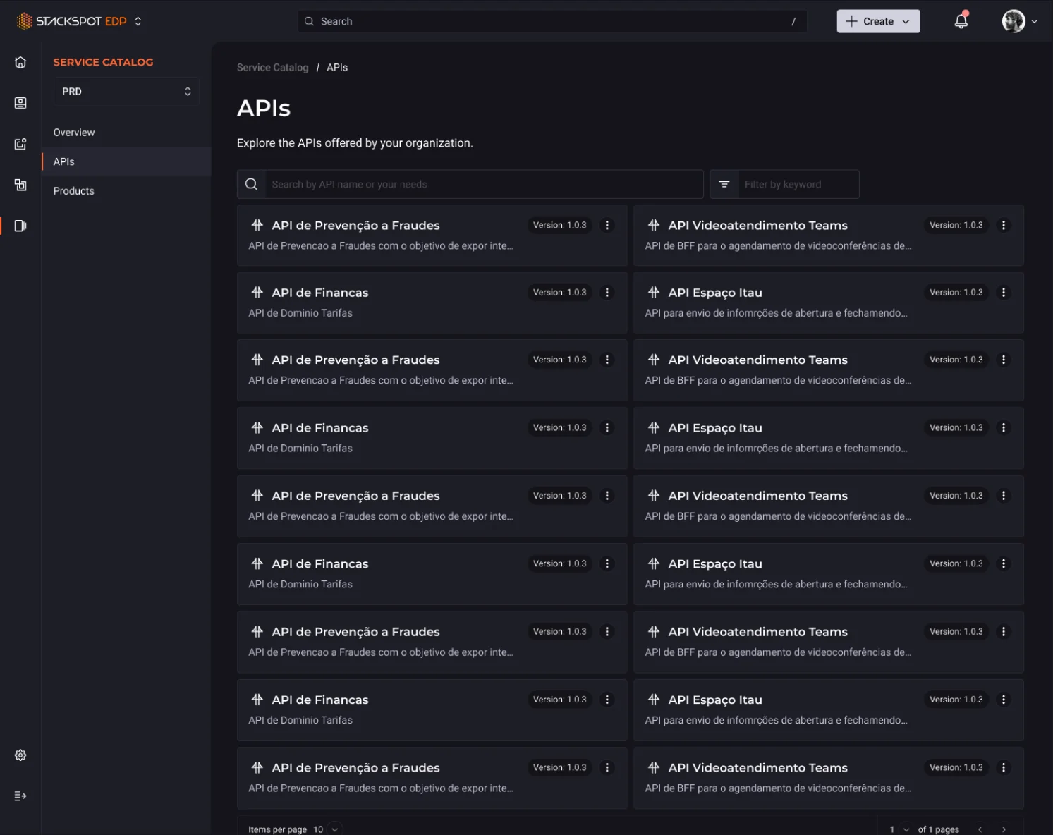
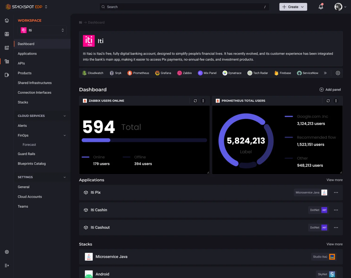
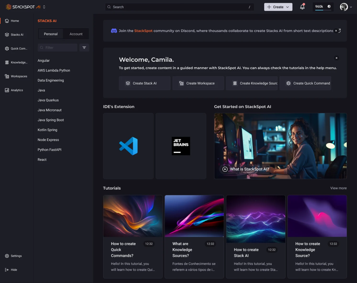
StackSpot is a platform created by Zup and Itaú Unibanco that empowers technology teams to operate with speed and security.
 UI/UX Design
Gamification Module
UI/UX Design
Gamification Module
Designed a gamification ecosystem for a shopping mall loyalty app, including missions, leaderboards, loyalty tiers, and admin management tools.