
UI/UX Design
Dashboard Redesign
What happens when the platform’s most important dashboard is no longer trusted by its users? This case explores the redesign of an admin dashboard that struggled with low adoption, fragmented information, and operational dependency. As part of a broader product rebranding initiative, the challenge was not only to modernize the experience but also to rebuild confidence in data, improve decision-making, and create a scalable foundation for future growth. From discovery to implementation, this project demonstrates how strategic design can transform a dashboard from a neglected feature into a valuable business tool.
Where I fit in
Alloyal is a B2B loyalty platform that manages subscriptions, points programs, or cashback for corporate clients across Brazil. The admin panel is the primary interface for client companies to track their program's performance, effectively the main product touchpoint for decision-makers on the client side.

My role
 Lead Product Designer, sole designer on the dashboard track.
- Working directly with the PM.
- Partnering closely with two engineers.
 End-to-end owner of the design process.

Collaborators
- Product Manager
- 2 engineers
- Customer Success team (5 CSMs)
- Data team (for metric validation)
 Cross-functional collaboration.

My Scope
- Discovery
- Information Architecture
- Design System
- Handoff & QA
 From research to production-ready.
The redesign was part of a broader admin panel rebranding initiative. I was responsible for the end-to-end design process, from running research sessions to delivering production-ready components through a Design System I created from scratch.
A dashboard no one trusted
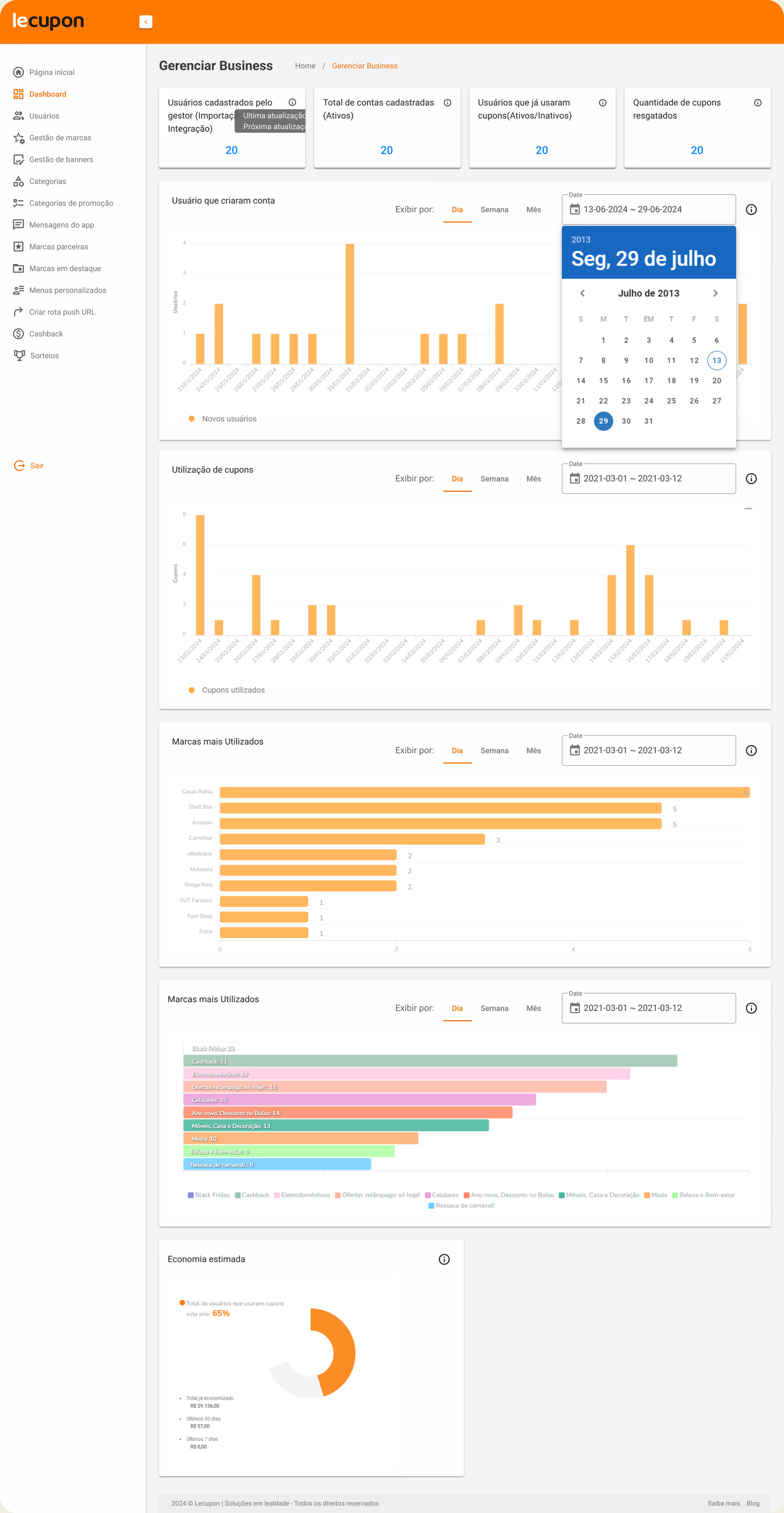
The initial analysis revealed five critical and interconnected failure points. The problems weren't isolated, they formed a cascade: metric errors eroded trust, which drove users away, which pushed volume to Customer Success, which leaned on external tools to compensate.

Data inconsistency
Calculation errors, mismatched metrics, and loss of trust in the dashboard.
 No DataLooks like this dashboard isn't being used.
Loss of trust in the dashboard
Low client adoption. The main persona (B2B client) avoided using the dashboard.





High volume of support tickets
Frequent requests for data correction, validation, increased operational cost and noise.
 Loading


Constant dependency for data interpretation and extraction
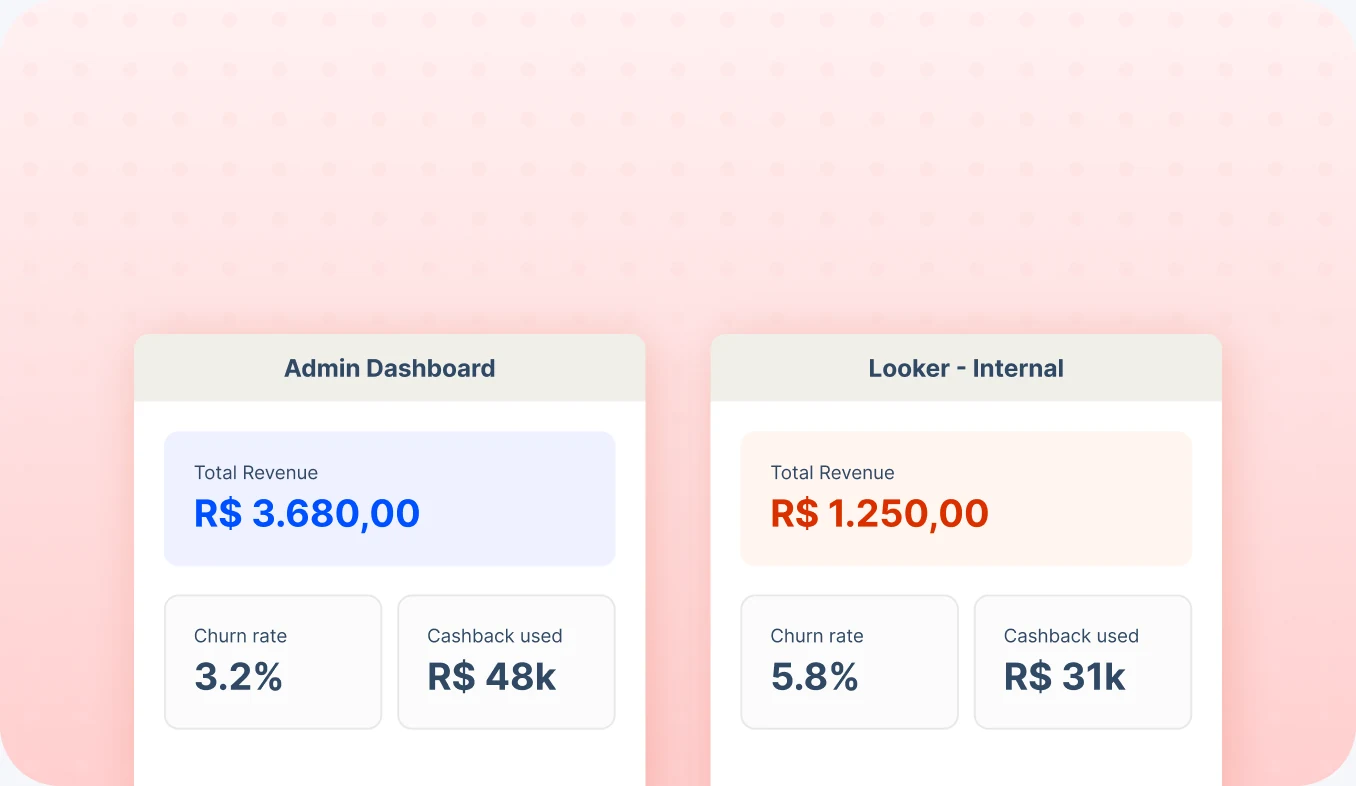
Use of external tools. The CS team relied on Looker for reliable reporting.
Clients weren't lazy, they were rational. When a tool can't be trusted, people route around it. Every ticket to CS was evidence of a design failure, not a user failure.
Reposition the dashboard as a product asset
The redesign had a clear strategic intent: make the dashboard something clients chose to use because it made them better at their jobs, not a feature they tolerated.
Single source of truth
Eliminate data discrepancies between the dashboard and CS reports
Self-service tool
Clients should be able to answer their own data questions without calling CS
Reduce CS load
Free up Customer Success from reactive data support to strategic conversations
Scalable foundation
Design System as infrastructure to support future analytics expansion
Understanding where trust broke down
Before touching any layout or component, I needed to understand exactly where the data pipeline was failing and how that shaped user behavior. I ran a three-pronged discovery over three weeks.
Method 01 - Stakeholder interviews
CS Team deep dive
Interviewed 4 Customer Success Managers individually. Asked them to walk me through a typical client data request: what was asked, what they had to look up, why they couldn't point the client to the dashboard.
"I open Looker first because I know the numbers there are right. Then I open the dashboard to show the client where to find things later, but I know the numbers won't match."
CSM, Interviewed in discovery
Method 02 - Client Sessions
5 Client interviews
Recruited 5 active B2B clients (finance team members at mid-to-large companies, the people who extract financial data from the dashboard and verify expired points, which carry a real cost for their companies) for 45-minute sessions. Observed them trying to answer real business questions using the existing dashboard. Tracked where they got stuck, what they expected to find, and when they gave up.
"I wanted to know how many points were about to expire this month. I couldn't find it, so I sent a WhatsApp to our account manager."
Client, Finance Analyst at a retail company
Method 03 - Data Cross-check
Metric audit with the data team
Together with a data analyst, I mapped every metric shown in the dashboard against its calculation logic and compared it to the equivalent in Looker. Found 7 discrepancies — 3 were critical (churn rate, active subscriber count, cashback utilization rate).
The biggest discrepancy was in how "active subscriber" was defined. The dashboard counted any subscription created in the period; Looker counted only those with at least one transaction. A ~30% difference in the same number.
Method 04 - Tickets analysis
Support ticket categorization
Analyzed 3 months of CS tickets tagged as "dashboard" or "data question." Categorized them by topic and mapped them to specific screens. This gave me a prioritization map: which data gaps or errors caused the most friction.
Churn interpretation (34%), points expiration visibility (28%), cashback reconciliation (21%).
A prioritized list of metric inconsistencies, a map of the most-requested data not available in the dashboard, and a clear picture of the two main user journeys (client reviewing program health vs. CS preparing a client report). These became the backbone of the IA redesign.
Five bets we made
Each bet paired a design change with a measurable outcome.
Cross-checked every metric with the CS team and data team before redesigning anything. Redefined calculation logic for the 3 critical metrics in collaboration with engineering.
Clear metric definitions agreed upon across CS, Product, and Engineering.
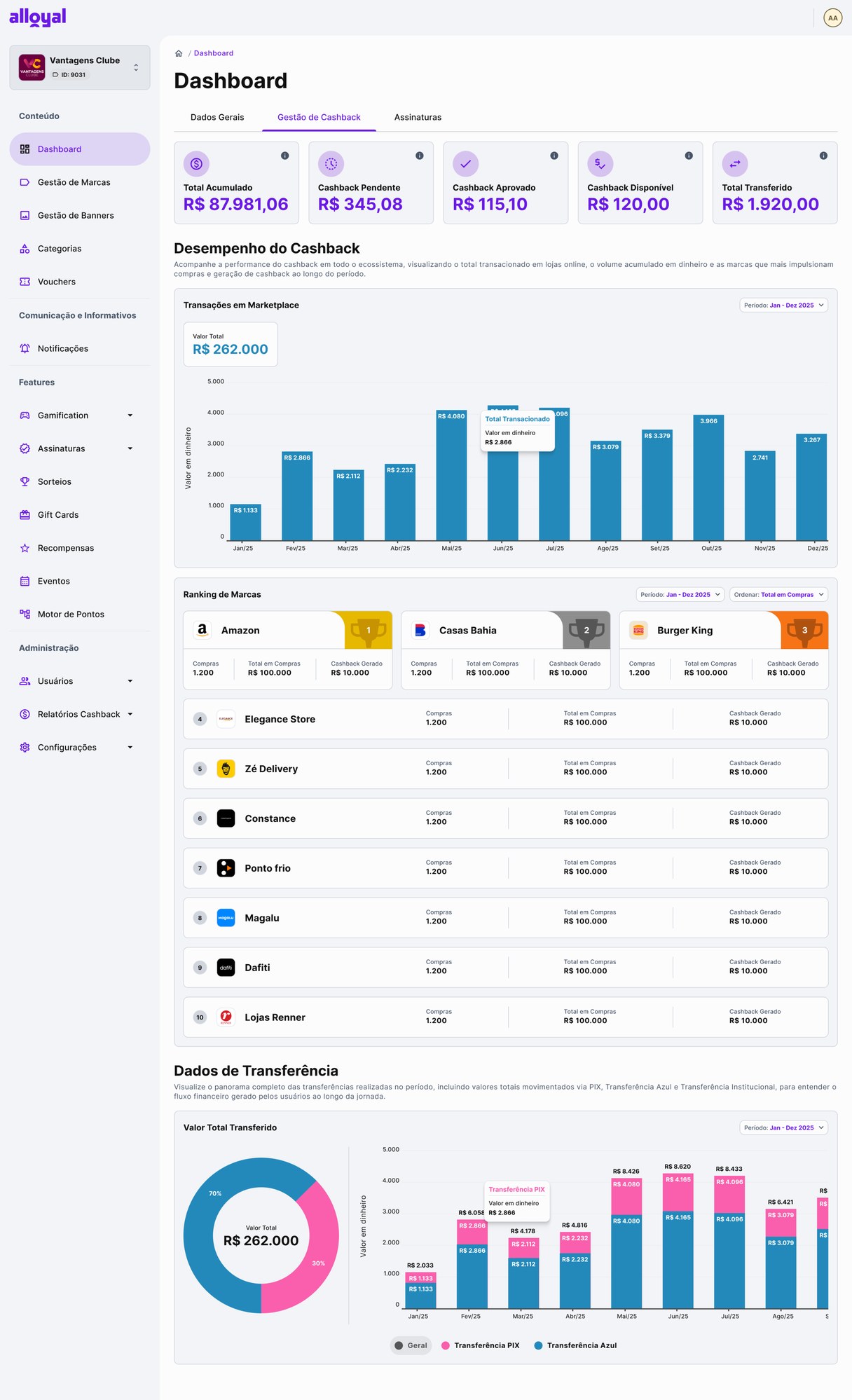
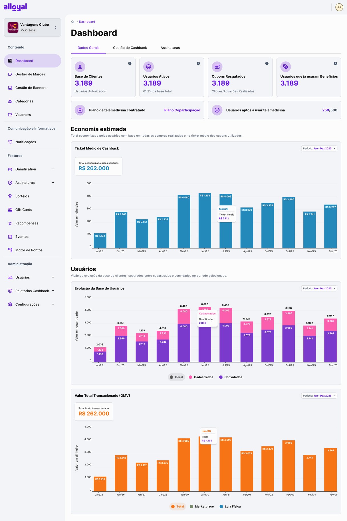
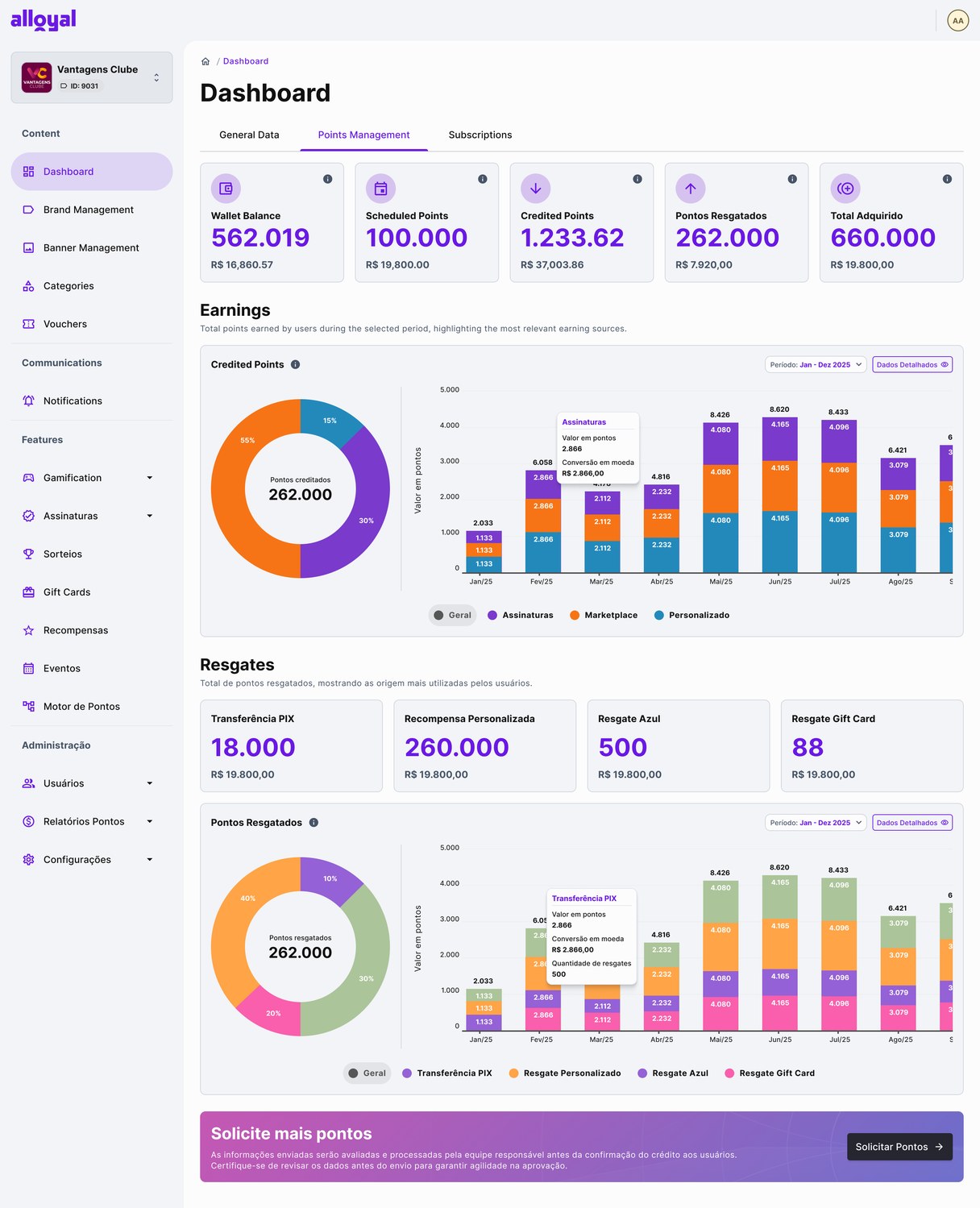
Reorganized the dashboard around three product domains (Subscriptions, Points, Cashback) with a clear separation between strategic KPIs and operational data. Applied progressive disclosure: overview → details.
Clients could navigate to their specific area without scanning the entire screen.
Added dedicated dashboards for each domain addressing the top ticket drivers: churn relative to active base (not absolute), points expiration timeline, cashback reconciliation view.
The three top ticket categories now have self-service answers in the product.
Added CSV export, period comparison controls, and contextual tooltips explaining metric definitions. The goal was to reduce the need to call CS even for edge cases.
Clients can now run their own ad-hoc analysis without CS involvement.
Created a dedicated Design System to ensure consistency across all three dashboard domains and the white-label environment. Standardized components, chart styles, typography, and all states (error, empty, loading).
New dashboard modules now take ~40% less design time due to reusable foundations.
Three decisions that shaped the outcome
These weren't obvious calls, each one involved a trade-off and a choice that could have gone differently. Here's the reasoning behind the ones that mattered most.
ALTERNATIVES CONSIDERED
WHY WE CHOSE THIS
Clients with 500 subs and 50 churned read it differently than those with 5,000 and 50 churned. The % framing made the same number actionable regardless of program size, and matched how clients actually talked about their business in interviews.
ALTERNATIVES CONSIDERED
WHY WE CHOSE THIS
Discovery showed clients were product-specific: a finance team reconciling a points program and its expired balances didn’t care about cashback metrics. A unified view forced them to visually filter every time. Domain-first reduced cognitive load and made the page feel relevant to each persona from the first click.
ALTERNATIVES CONSIDERED
WHY WE CHOSE THIS
Three domains shipping without a shared foundation would inevitably drift, undermining the consistent, reliable perception we needed to rebuild. Doing the DS first also paid off immediately: the Cashback domain shipped ~40% faster. I mapped that gain against the 3-week investment and the PM aligned.
A redesigned experience on three pillars
A redesigned dashboard experience based on three pillars:
Reliability
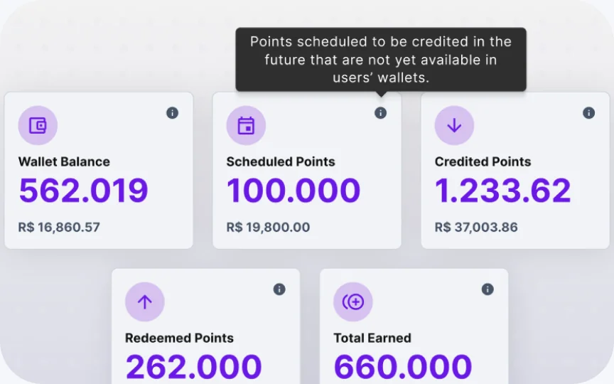
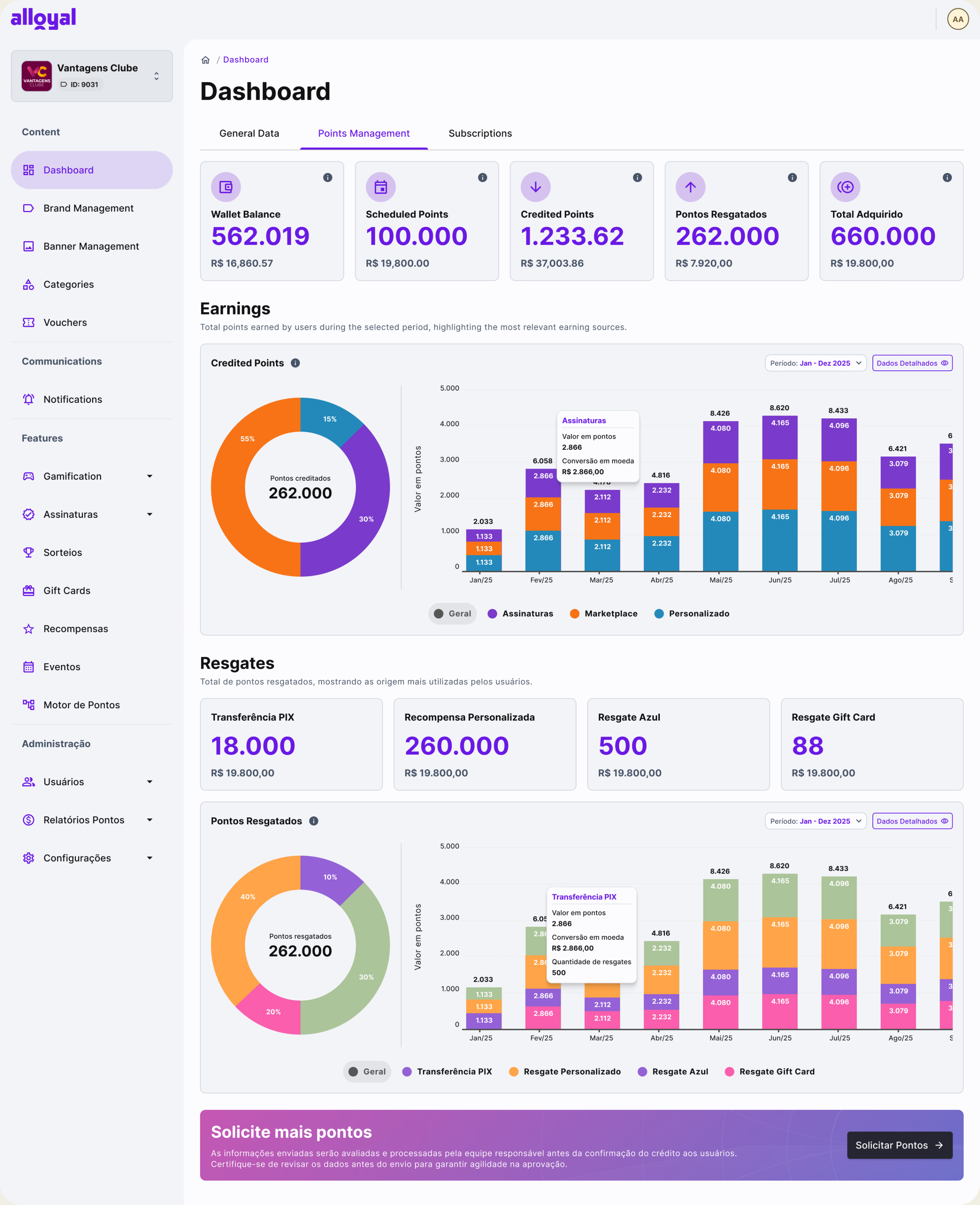
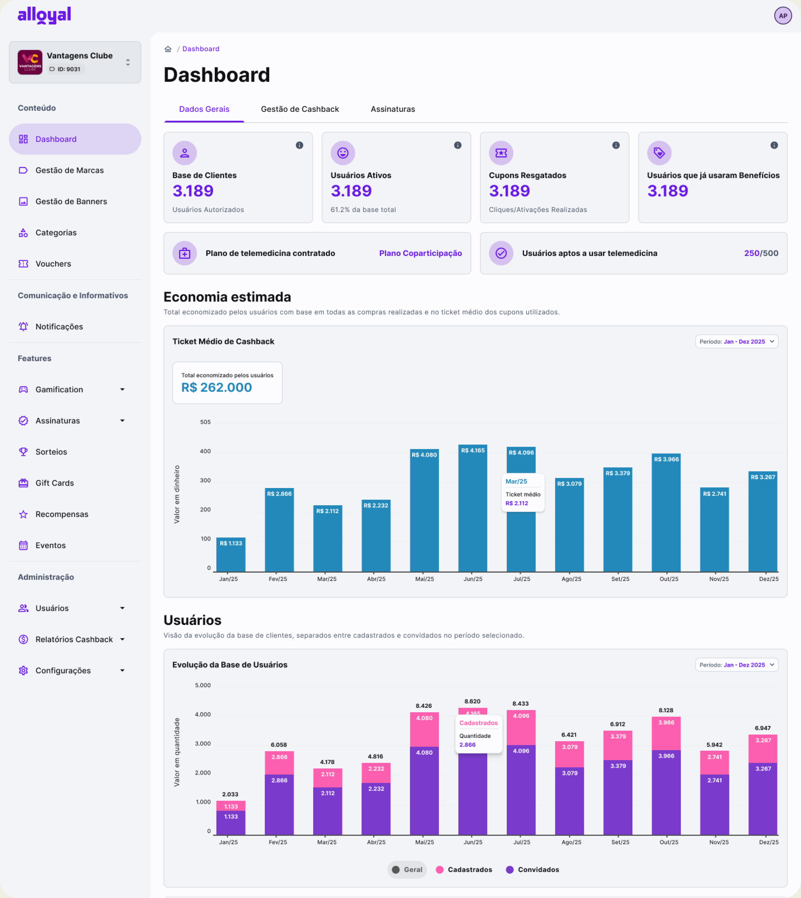
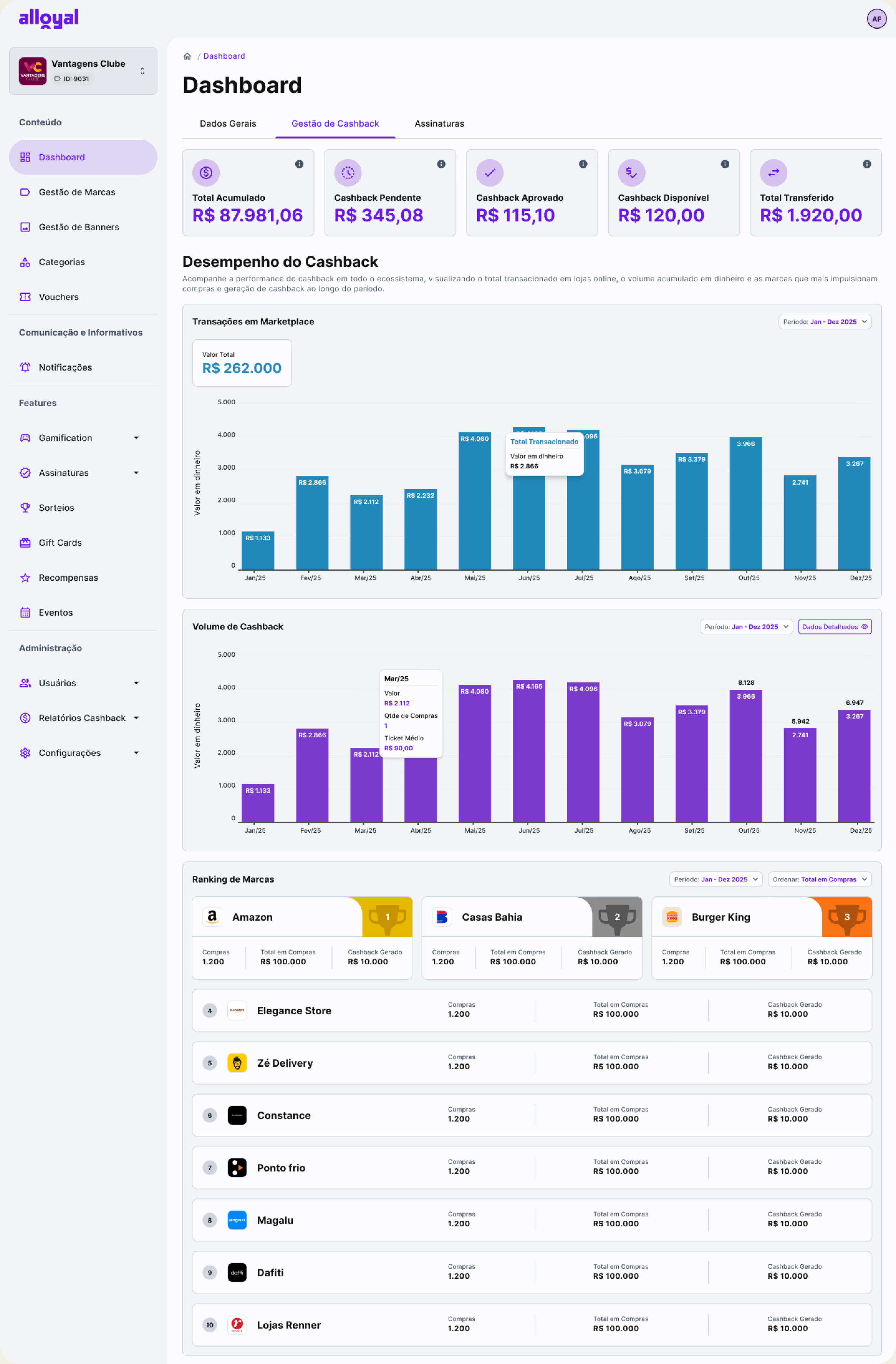
Metrics were validated with Customer Success and clients, with consistent calculation logic documented and aligned with Engineering, while every KPI card includes clear tooltip definitions to ensure transparency and shared understanding.
Clarity
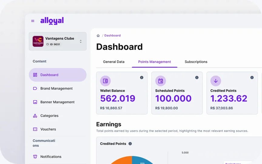
The information architecture was organized around a domain-first navigation structure, establishing a strong visual hierarchy between strategic and operational data while using progressive disclosure to guide users seamlessly from high-level overviews into detailed insights.
Autonomy
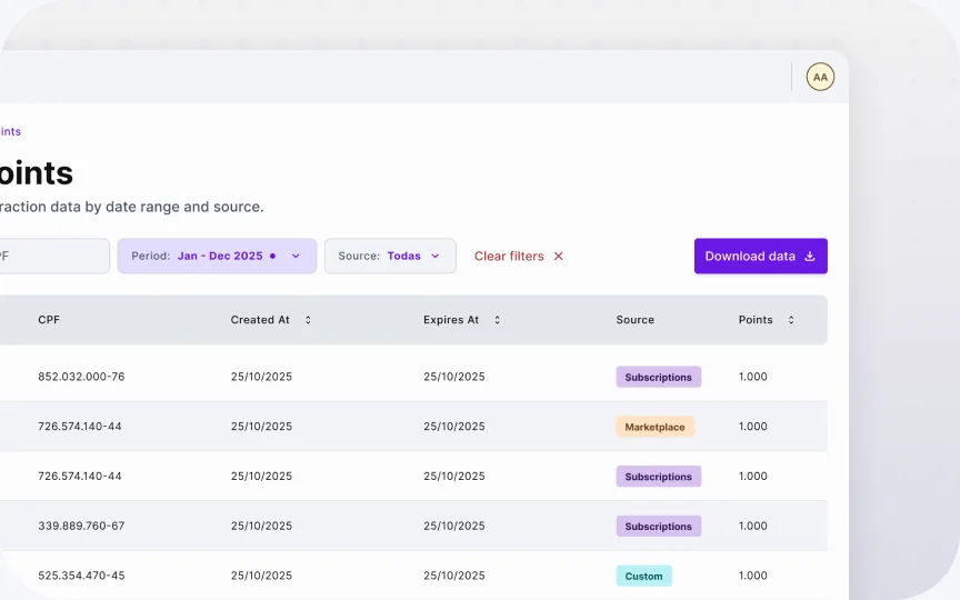
Every data table supports CSV export and period comparison controls, enabling users to analyze trends independently through a centralized source of truth without relying on Customer Success for routine data requests.
The case for building the DS before shipping the dashboard
The redesign wasn't a single screen — it was three interconnected dashboard domains (Subscriptions, Points, Cashback), all part of a broader admin panel rebranding. Without a shared foundation, each domain would inevitably drift: different chart styles, inconsistent card layouts, varying empty states. That fragmentation would have directly undermined the "reliable and trustworthy" perception we were trying to rebuild.

The DS was also the backbone of the rebranding itself. Alloyal needed the admin panel to feel modern and trustworthy — not just the dashboard, but the entire product surface clients interact with. A shared system made that consistent upgrade possible without having to redesign every screen from scratch.
What the system covered
Components built and documented
Reusable, consistent components ready to scale.
Chart types standardized
Consistent visualization patterns across all domains.
System states defined
Error, empty, loading and partial data states documented.
Reduction in design time
For the cashback domain.
Domains using a single library
Promoting consistency and faster delivery.
Single source of truth
Figma library aligned with Engineering.
The system standardized typography, spacing, color usage, chart patterns, and all interface states. Engineering had a single reference point, eliminating the class of issues where the same component looks different across screens. The DS evolved from a UI deliverable into the structural foundation of a more mature, coherent product.
Outcomes across three audiences
FOR CLIENTS
Clients reported answering program questions independently
Increased confidence in platform data, fewer escalations
FOR INTERNAL TEAMS
Significant reduction in dashboard-related data correction requests
CS no longer needs external tools for most client data queries
FOR THE PRODUCT
Dashboard repositioned from support tool to product feature
DS foundation supports expansion to new analytics modules
What this project reinforced
Reliable data matters more than visuals
The biggest design problem here wasn't the UI — it was the underlying data quality. No amount of visual refinement would have fixed a dashboard that was telling users the wrong numbers. Discovery has to include the data layer, not just the interface.
Dashboards are decision-making tools, not visualizations
The question isn't "does this chart look good?" but "does this help someone take action?" Every design decision was evaluated against whether it helped a client decide something about their loyalty program, not whether it was aesthetically interesting.
A Design System is product infrastructure, not a UI kit
The DS unlocked speed and consistency, but its real value was enabling the white-label environment to scale without fragmentation. Treat it as an engineering investment with a design face — and make that argument to stakeholders with concrete numbers.
Centralizing data reduces operational cost
Every ticket CS received was a cost — in time, context switching, and eroded client trust. Design that enables self-service has a measurable business impact. Framing the redesign this way helped align PM, CS leadership, and engineering around the same priority.
What I'd do differently
What worked well
- Running the metric audit before designing anything. It was tempting to start with wireframes, but spending time in the data layer first saved us from shipping a prettier version of the same broken experience.
- Building the DS in parallel with the dashboard. The initial investment paid off immediately on the second domain (Cashback) which shipped in half the expected time.
- Using CS as a research partner, not just a stakeholder. Their institutional knowledge of client pain points was the most valuable input in discovery.
What I'd change
- Involve engineering earlier in metric definition. The calculation logic changes surfaced late in development, pushing launch by two sprints. I'd run a technical feasibility session in the discovery phase.
- Set up quantitative baseline metrics before launch. We didn't have a clear pre-launch ticket count or Looker usage baseline, which made it harder to quantify the impact afterward. I'd instrument that from the start.
- Test with more client archetypes. We had 5 clients in research — all finance team members at mid-to-large companies. I'd have recruited at least one small company and one from a different vertical to stress-test the IA assumptions.
More projects
View all UI / UX Design
Charles C.D.
UI / UX Design
Charles C.D.
Charles is a continuous deployment tool that speeds up the feedback cycle of your application through simultaneous validation with specific user groups.
 Design System
Citric Design System
Design System
Citric Design System
Citric is a design system that helps create clean, consistent, and scalable interfaces. It unifies styles, components, and rules, making the design process faster.