

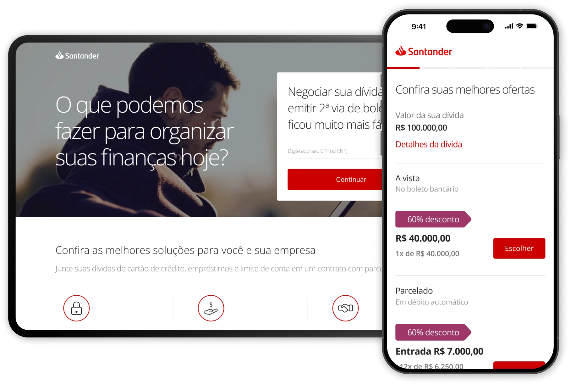
UI/UX Design
Debt Renegotiation
Bringing a fully offline negotiation journey online, covering the entire flow, from the initial CPF or CNPJ identification to signing the agreement and paying by slip or direct debit.
The Challenge
Santander Brasil serves millions of retail customers, and a share of them carry overdue balances on cards, loans and account limits. Recovering that money is a business line of its own, run by the collections area through the contact center and the branch network.
At the time, the bank had no digital renegotiation product. Everything the collections area did, finding the customer, presenting an offer, closing an agreement, issuing the payment slip, happened through people, on the phone or at a counter.
The problem

There was no way to find out what you owed without talking to someone. Terms were explained out loud, one option at a time, with no room to compare them or think them over. And after reaching an agreement on the phone, you still had to go to a bank branch in person to formalize the negotiation and set up payment by slip or direct debit.
The bank also called customers about their overdue balances, and those calls were frequently declined. People already tend to avoid this kind of conversation, and a collections call is hardly the best moment to have it.

Recovery depended entirely on two expensive channels. Every agreement consumed contact-center time, and the outbound calls that fed the funnel were being rejected before a negotiation could even start.
Having to go to a branch in person to formalize the agreement and set up payment by slip or direct debit added a last handoff between “yes” and the money actually arriving, a step where agreements were quietly lost. Each handoff was both a cost and a drop-off point.
A fragmented, multi-channel journey
Calls, contact center and a branch visit just to complete an agreement.

One continuous digital journey
From debt discovery to payment slip in a single web experience.


One channel. One session, no calls or branch visits.

Where I fit in
I joined the project as an outsourced product designer, embedded in the Santander team, with the challenge of turning a renegotiation journey that until then ran through offline channels into a viable digital experience. I worked from the learnings and direction the in-house team had already built, connecting customer needs, business rules and technical constraints to take the solution from structuring the flow to the final interface on desktop and mobile.
 My role
I owned the journey itself: the sequence of steps, what each screen had to decide, and every state around them, including the exceptions. I designed the desktop and mobile screens on the bank's components and specified the behavior engineering needed to build them.
 Santander design team
The bank's own designers owned research and the design system. They set the direction and the components; I worked inside both, taking the flow from structure to finished screens.
 Product manager
We worked through the offer rules together: which conditions could be shown without a human, what the automated approval limit should be, and which parts of the negotiation had to stay with a person. Scope was cut around that line.
 Collections specialists
The people who ran these negotiations by phone were the real source of the content. Their call scripts became the hierarchy of offers on screen, and their objection handling became the copy.
 Engineering
The legacy collections and slip-issuance systems set hard constraints: response times, service hours, what could be recalculated live. Several screens, including the off-hours state, exist because of them.
 Legal and compliance
Terms, contract conditions and what could legally be displayed before the customer was authenticated.
The Flow, as a decision tree
Written out this way, the project stops looking like a set of screens and starts looking like what it is: a negotiation with branches. Most of the design work sits in the answers on the right and left of the spine, not in the straight line down the middle.
Seeing the debt clearly
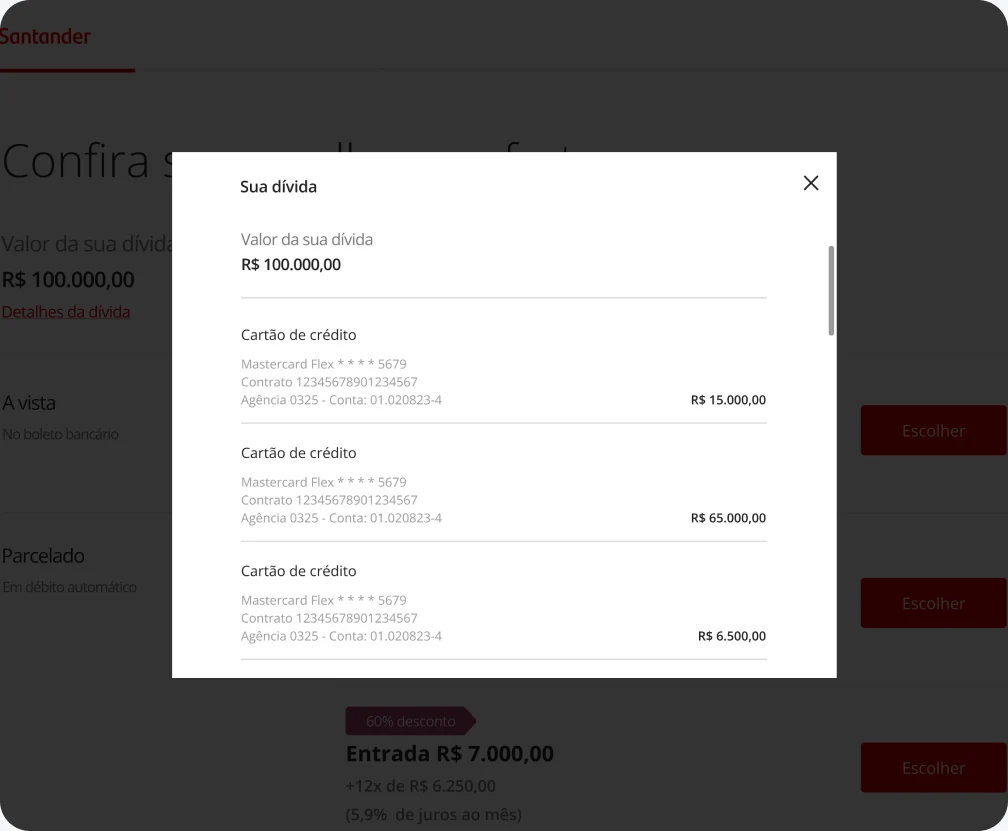
Entry asks for one thing: the CPF or CNPJ. From there the person sees the total amount and, behind it, the breakdown by contract, card, loan, account, with the details they need to recognize what is actually theirs.
Offers come ranked by what the bank can approve, from a single payment on a bank slip to installments on direct debit, with rates and down payment stated up front instead of negotiated over the phone.
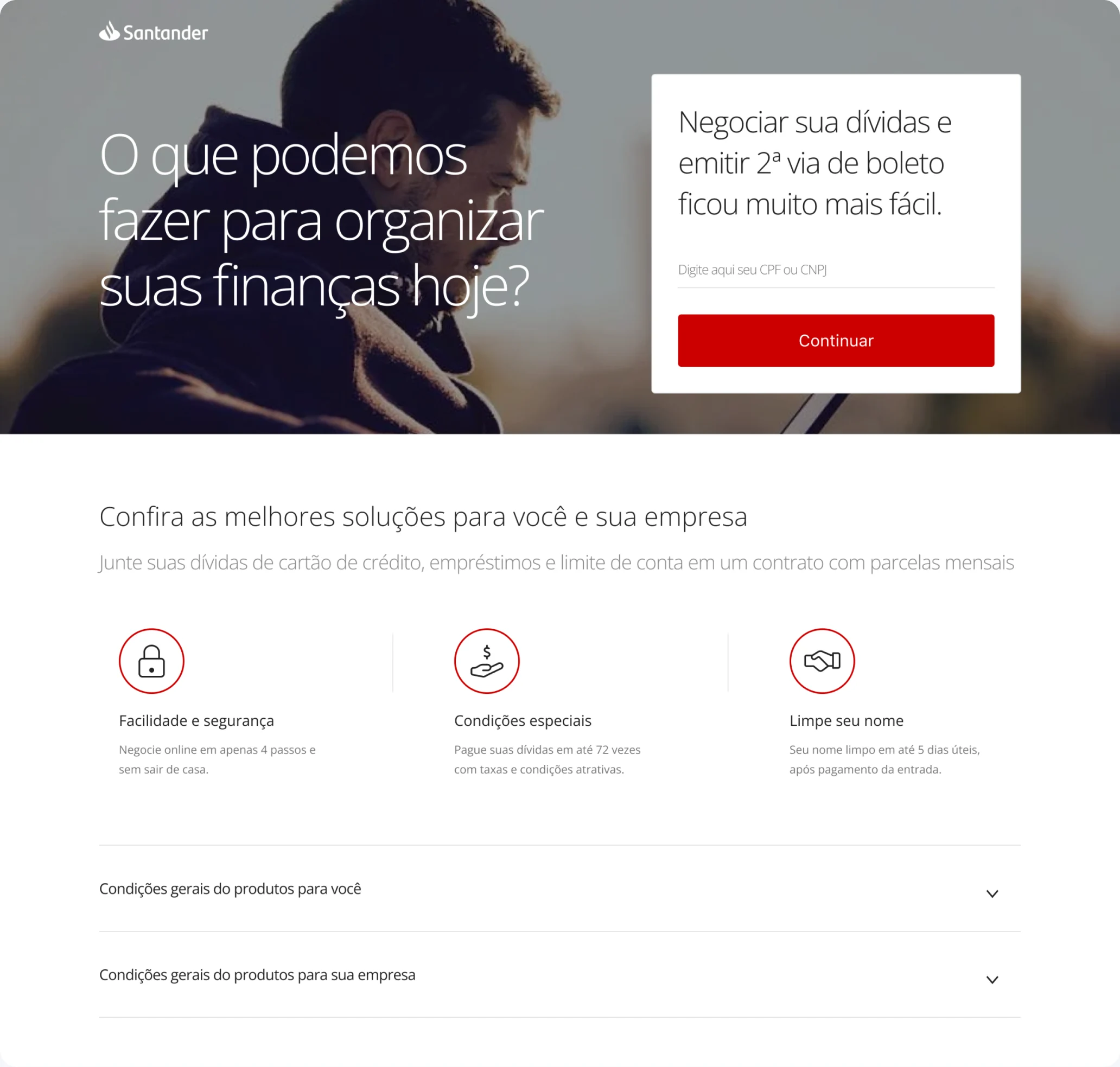
The door that didn't exist: one field, no login, no phone number to call.
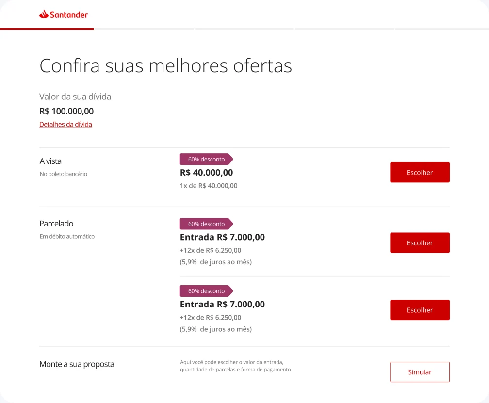
Total debt on top, offers ranked below: cash on a slip, installments on direct debit.
Contract by contract, with card and account numbers. The moment people stop doubting the number.
Decision
Open the flow with a CPF instead of a login. Many people in default avoid the app or no longer remember their credentials, and requiring a password would have kept out exactly the audience the project existed for.
Trade-off
That meant a weaker gate at the front, so full identity confirmation moved to the end, right before the agreement is signed, and we limited how much contract detail appears before it.
A proposal that fits
Instead of being limited to fixed offers, the customer can simulate a proposal that fits their own reality, adjusting the down payment, the number of installments and the payment method. With every choice, the conditions are recalculated in real time. Incentives appear at the moment of decision: choosing direct debit, for example, waives the account package fee for six months.
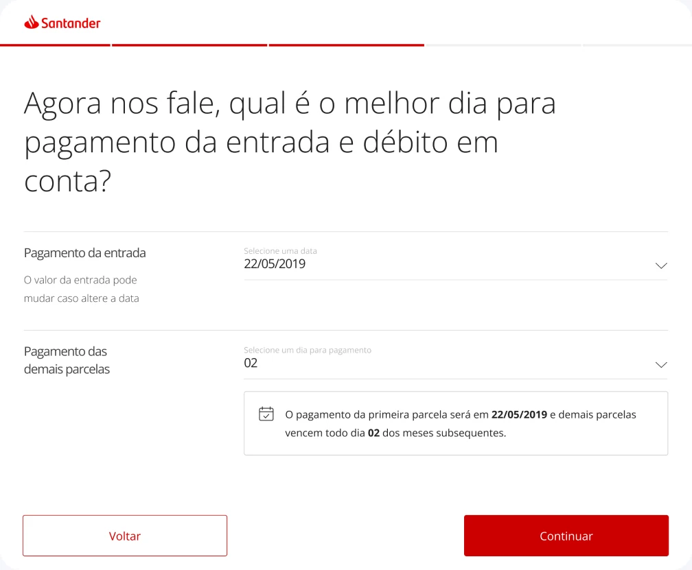
They can also pick the best day of the month to pay the down payment and the remaining installments, adapting the agreement to their own cash flow.
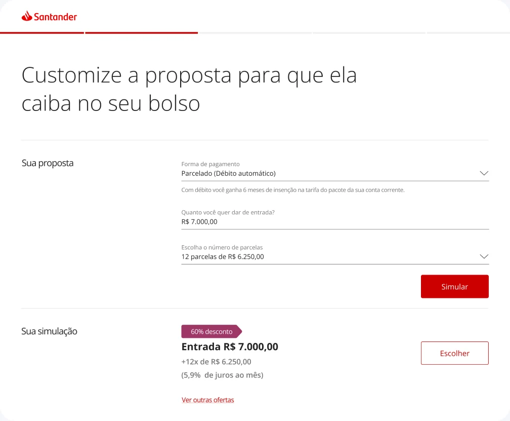
Down payment, installments and method on one screen, with the simulation updating as they move.
Choosing the due dates, and being told up front that moving the date changes the down payment.
Decision
Let people counter-offer. On the phone, negotiation is a conversation; a screen with three fixed offers would have lost everyone whose real constraint was the due date or the size of the down payment.
Trade-off
A configurable proposal produces combinations the system can't approve on its own. Rather than blocking those inputs, we let the customer ask and built a route to a manager. More edge cases to design, but no arbitrary walls.
Closing it without the bank branch
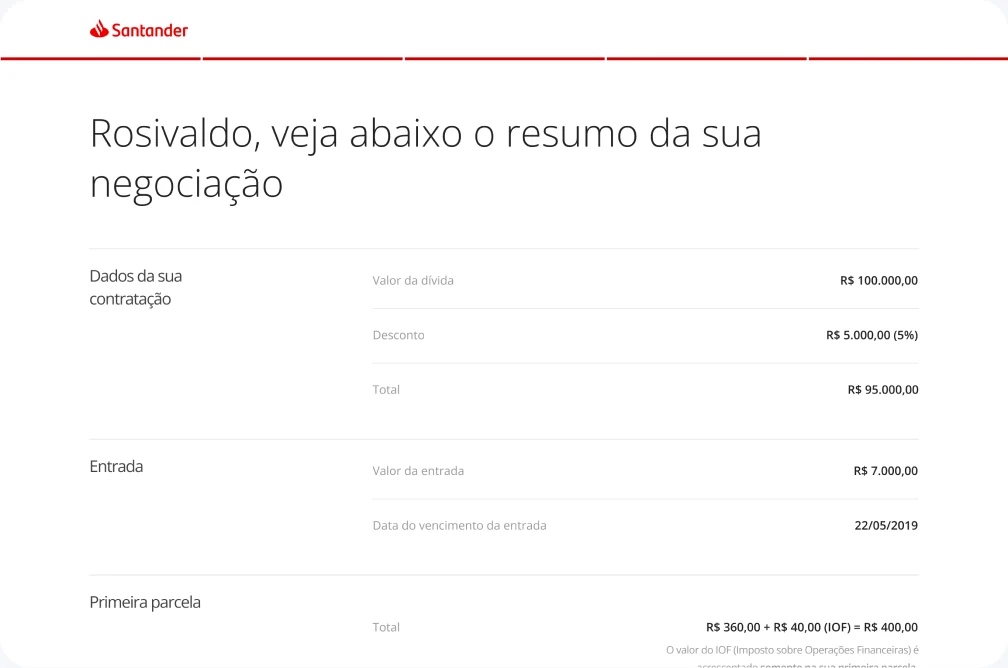
Identity is confirmed by an SMS code, with a path to update an outdated number instead of dead-ending the journey. A summary screen, with variations for cash or installments, slip or direct debit, puts every condition in front of the customer before they commit.
The success screen delivers the payment slip immediately, with a copyable barcode. The trip to the bank branch disappears from the journey.
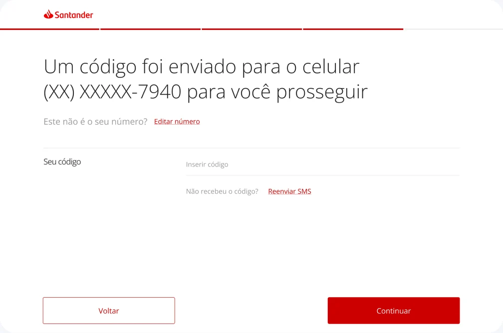
SMS confirmation, with a way out for customers whose registered number is old.
One summary layout that had to hold four combinations of payment method and plan.
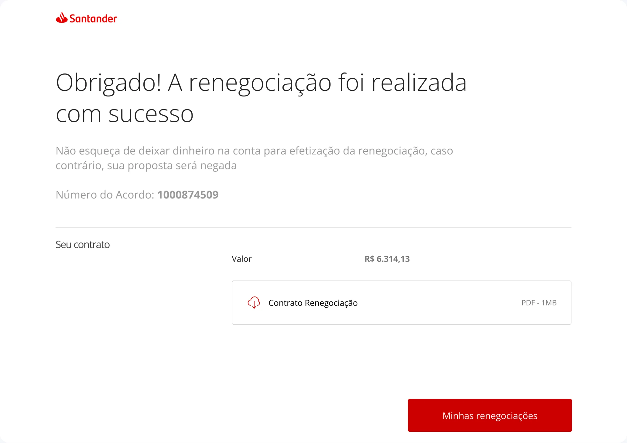
Agreement number, amount and the contract ready to download. This screen replaces the trip to the bank branch.
Decision
Issue the slip on screen, in the same session. Sending it by email or leaving it at a branch would have reintroduced the gap between agreeing and paying, the exact gap where the old journey leaked.
Trade-off
That tied the flow to systems that don't run around the clock, so the product had to admit it: an explicit off-hours state instead of a slip that silently fails to arrive.
The edges nobody sees in a demo
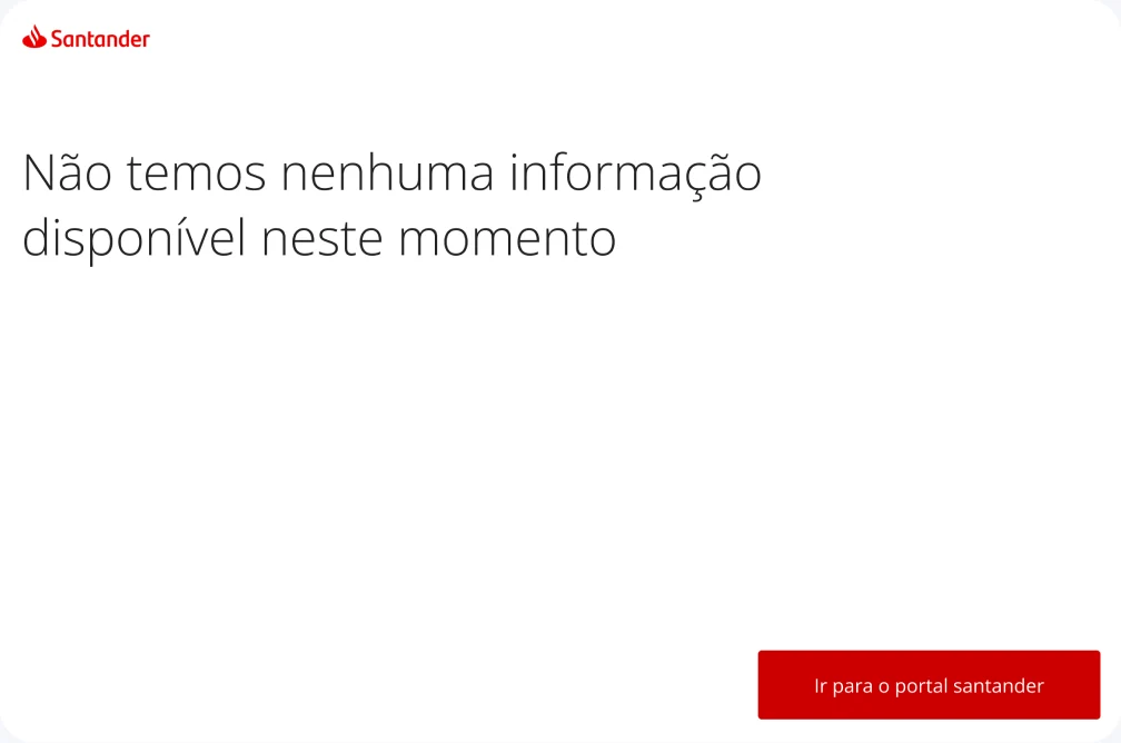
A collections flow is mostly exceptions, and those got the same attention as the happy path: no debt found, off-hours attempts, and proposals outside the automated approval limit routed to a manager instead of failing silently.
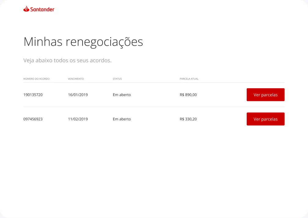
“Minhas renegociações” closes the loop: customers track active agreements, retrieve slips for the next installments and cancel proposals on their own.
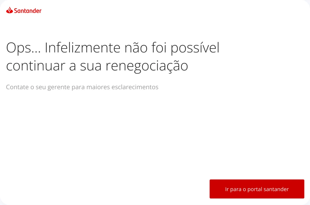
Beyond the automated limit: handed to the manager, not to a dead end.
Nothing to renegotiate, said plainly and without implying an error.
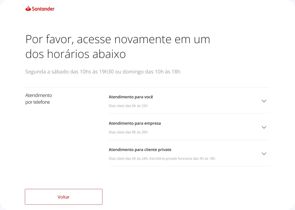
Off hours: when to come back, since the systems behind it don't run 24/7.
“Minhas renegociações”: active agreements, next slips and cancellations, without calling anyone.
Decision
Spend real design time on the states that fail. In collections, the exception is not rare: wrong phone numbers, expired offers and amounts above the limit are ordinary Tuesday traffic.
Trade-off
It pushed polish on the happy path to a later release, and grew the number of screens engineering had to build. Accepted because a dead end here means a customer who never comes back.
Mobile Navigation
Results and impact
The outcomes stayed inside the bank. Compliance policy keeps them off this page, but I am glad to walk through what happened in a conversation.
More projects
View all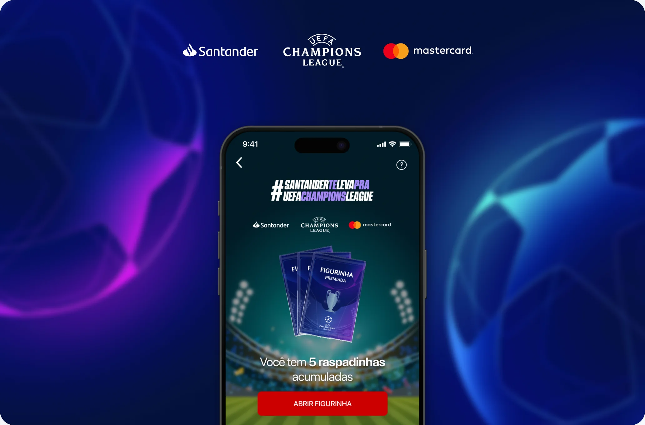 UI/UX Design
Santander and Champions League
UI/UX Design
Santander and Champions League
A sticker album every Brazilian grew up with, rebuilt inside a banking app and taken from brief to proposal in two days.
 Design System
Citric Design System
Design System
Citric Design System
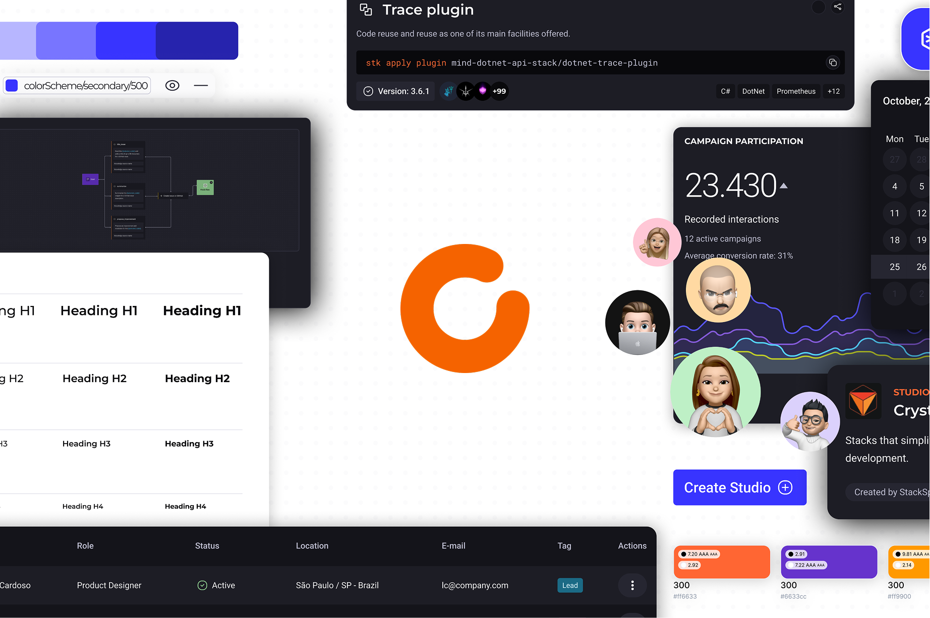
Citric is a design system that helps create clean, consistent, and scalable interfaces. It unifies styles, components, and rules, making the design process faster.